I have this class for datepicker:
    DateTime? selectedDate = await showDatePicker(
      context: context,
      initialDate: initialDate ?? DateTime.now(),
      firstDate: firstDate ?? DateTime(1900),
      lastDate: lastDate ?? DateTime.now().add(Duration(days: 3650)),
      builder: (context, child) {
        return Theme(
          data: ThemeData.light().copyWith(
            colorScheme: const ColorScheme.light(
              onPrimary: Colors.white,
              onSurface: Colors.white,
              primary: Color(0xff11619c),
            ),
            dialogBackgroundColor: Color(0xff5994c7),
            dialogTheme: DialogTheme(
              shape: RoundedRectangleBorder(
                borderRadius: BorderRadius.circular(16.0),
              ),
            ),
            textButtonTheme: TextButtonThemeData(
              style: TextButton.styleFrom(
                textStyle: TextStyle(
                  color: Colors.white,
                  fontWeight: FontWeight.normal,
                  fontSize: ScreenUtil().setSp(AppSize.textSize12),
                  fontFamily: 'Quicksand',
                ),
                foregroundColor: Colors.white,
                backgroundColor: Color(0xff5994c7),
                // backgroundColor: Color(0xff5994c7),
                shape: RoundedRectangleBorder(
                  side: const BorderSide(
                    color: Colors.transparent,
                    width: 1,
                    style: BorderStyle.solid,
                  ),
                  borderRadius: BorderRadius.circular(50),
                ),
              ),
            ),
          ),
          child: child!,
        );
      },
    );
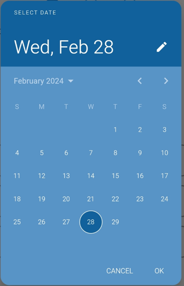
That was my datepicker before flutter update:
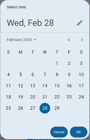
But after update and changed Material 2 to Material 3 the datepicker is:
How i can restore first variant of datepicker?
I tried options from the documentation but it didn't work.
Set a custom DatePickerThemeData to the datePickerTheme property of the ThemeData.
data: ThemeData.light().copyWith(
  // ...
  datePickerTheme: DatePickerThemeData(
    headerBackgroundColor: Color(0xff11619c),
    backgroundColor: Color(0xff5994c7),
  ),
),
Tip: Most of the styling options that you need for the date picker are actually in this DatePickerThemeData class.
To change the color of the DatePicker in Material 3 Flutter, you can customize the appearance of the dialog by providing a custom builder to the showDatePicker function. You need to adjust the color scheme and other styling properties within the builder to achieve the desired look. Below is an example of how you can modify your existing code to change the color of the DatePicker:
DateTime? selectedDate = await showDatePicker(
  context: context,
  initialDate: initialDate ?? DateTime.now(),
  firstDate: firstDate ?? DateTime(1900),
  lastDate: lastDate ?? DateTime.now().add(Duration(days: 3650)),
  builder: (context, child) {
    return Theme(
      data: ThemeData.light().copyWith(
        colorScheme: ColorScheme.light(
          primary: Colors.blue, // Change the primary color
          onPrimary: Colors.white,
        ),
        dialogBackgroundColor: Colors.grey[200], // Change the background color of the dialog
        textButtonTheme: TextButtonThemeData(
          style: TextButton.styleFrom(
            primary: Colors.blue, // Change the text color of buttons
          ),
        ),
      ),
      child: child!,
    );
  },
);
In this modified code:
colorScheme.primary is set to Colors.blue to change the primary color of the DatePicker.dialogBackgroundColor is set to Colors.grey[200] to change the background color of the dialog.
textButtonTheme.style.primary is set to Colors.blue to change the text color of the buttons.
You can adjust these color values according to your desired color scheme. By customizing these properties within the Theme data, you can achieve the desired appearance for your DatePicker in Material 3 Flutter.